Macro Maps Help You Align Processes and Strategy

- IT bought some software and needs to install it, so let’s look at the current process first.
- A leader raised his hand and said, “I’d like to start with this one.”
- A department wants to improve the process because it would help in a key initiative.
- An ‘easy’ process is chosen to start on.
But after a number of processes are selected with this ‘whoever is interested’ approach, leaders and process Improvement practitioners see that it would make sense to select processes that are underperforming, would provide increases in market share and revenue, or would directly support key strategic initiatives. In order to do that, you need to have an understanding of core process in the company now. A Macro Map can help.
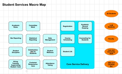
A Macro Map is a graphical rendering of an organization as a portfolio of processes. (Many thanks to my colleague Jerry Talley for initially developing this concept of a Macro Map. [www.jlTalley.com] He and I have been using it and improving it ever since.) Here’s an example:
In this example, the core processes (ones that produce the key outputs of the organization) are highlighted in one section, support processes in another section, and customers in the third section.
How do you Build a Macro Map?
I suggest starting with a small group of executives/managers who know the work of the department or division. (If you are doing this for the whole enterprise, you will need to build it by groups and then form the total picture, making sure to show the cross functional processes.) Build the first draft of the macro map with them, and then take it to staff and have them verify it and add to it. Below are some specifics to help you with the method.
With the managers:
- Begin with listing the customers – the people who receive or use the output.
- Then list the core products or services delivered by the department.
- Now identify the processes that produce the core products.
- Then identify the processes that support the delivery of the core products. Examples of these could be planning, scheduling staff, research, securing resources.
Then take the map in graphic form to a representative staff group.
- Explain how you built the first draft of the map with the managers, and what its components are.
- Start with the core processes and ask them if anything is missing or needs revision.
- Then go to the support processes.
- Ask them if they can see the components of their job in different place on the Macro Map. What components of their job are missing?
- Keep adding and revising the map as suggestions are made.
How the Macro Map is Used
- The Macro Map provides a list of the portfolio of processes for the department or organization. This enables anyone to compare the voice shouting the loudest for a process selection to be compared to the whole portfolio. START HERE
- These processes are categorized, so it’s easy to see which are the core ones supporting customer deliverables, and what other types of processes there are. (This helps to make it clear which ones are the most important to the customers.)
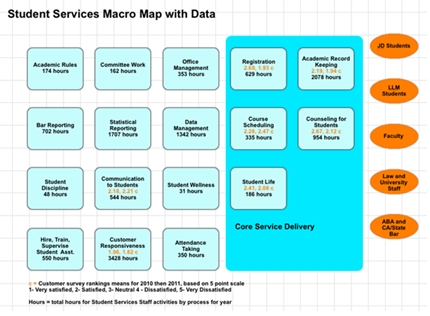
- Add quantitative data to the Macro Map. The Macro Map below is the same one as shown at the top, but now it has data showing number of hours worked on each process and the customer satisfaction ranking. It is obvious which ones demand the most employee time. And for this organization, where the goal was to streamline processes, reduce workload, and not hire additional employees, it was obvious which ones to work on first.
Some organizations create a Business Architecture graphic to show how business strategy, functions, processes, technology and data relate. The Macro Map is simpler than that and focuses on processes and customers. When you add baseline data to a Macro Map, you visualize the criteria that the organization has chosen to use to prioritize their projects. In the example for Student Services it was employee hours and customer ratings. Those might now have been my choice, but the organization had these metrics and they worked fine. When doing the first Macro Maps I like to keep the measurement simple – not requiring weeks to gather. Other measurement criteria could include costs, throughput, comparisons against competitors, variability, market share, risk, or alignment with the strategy. Quantitative measurement values point to the top three to five processes, but leaders need to consider some other parameters – namely time to complete, complexity, cost, etc. that could influence the choice of one project or another.
The macro map is a wonderful info graphic to display and categorize all the processes. It also gets executives and employees engaged in thinking about the big picture by process, and helps each one relate it to their own work. And it doesn’t take that long to build. Try it!
About the Author

, is a highly respected BPM Practitioner. She provides consultation, workshops and training programs for clients ranging from start-ups to Fortune 500 companies, educational institutions, and government organizations. Her programs are based on a unique 3-PEAT method of modeling processes and analyzing data that accelerates operational improvements, and builds leaders and employees who sustain operational excellence. Want to learn more about BPM metrics? Email Shelley at: [email protected]


Leave a Reply
Want to join the discussion?Feel free to contribute!